Ice Cream Madness
PROJECT:
A fictional ice cream festival held at the Ace Hotel in Palm Springs.
WHAT I DID:
This self initiated project was imagined entirely by me, and I created all logos, icons, marketing materials and merchandise mock ups.
REASONING:
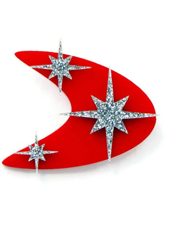
The visual identity of Ice Cream Madness is inspired by midcentury “atomic” space age designs, as well as the googie architecture style of diners and roadside attractions.
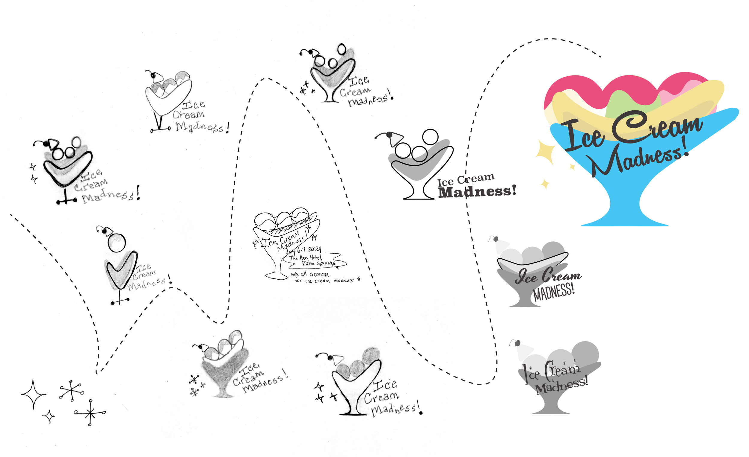
I approached the logo by considering the iconic boomerang shape. Its similarities to a bowl, and also a banana, lead me to the idea of a banana split. This not only communicated the purpose of the event, but also its location - Palm Springs, which is known as a mecca of midcentury modern architecture.
BRAND COLOR PALETTE
#E84F7F
#4CC4F2
#F7B1C8
#C4DF97
#F4E294
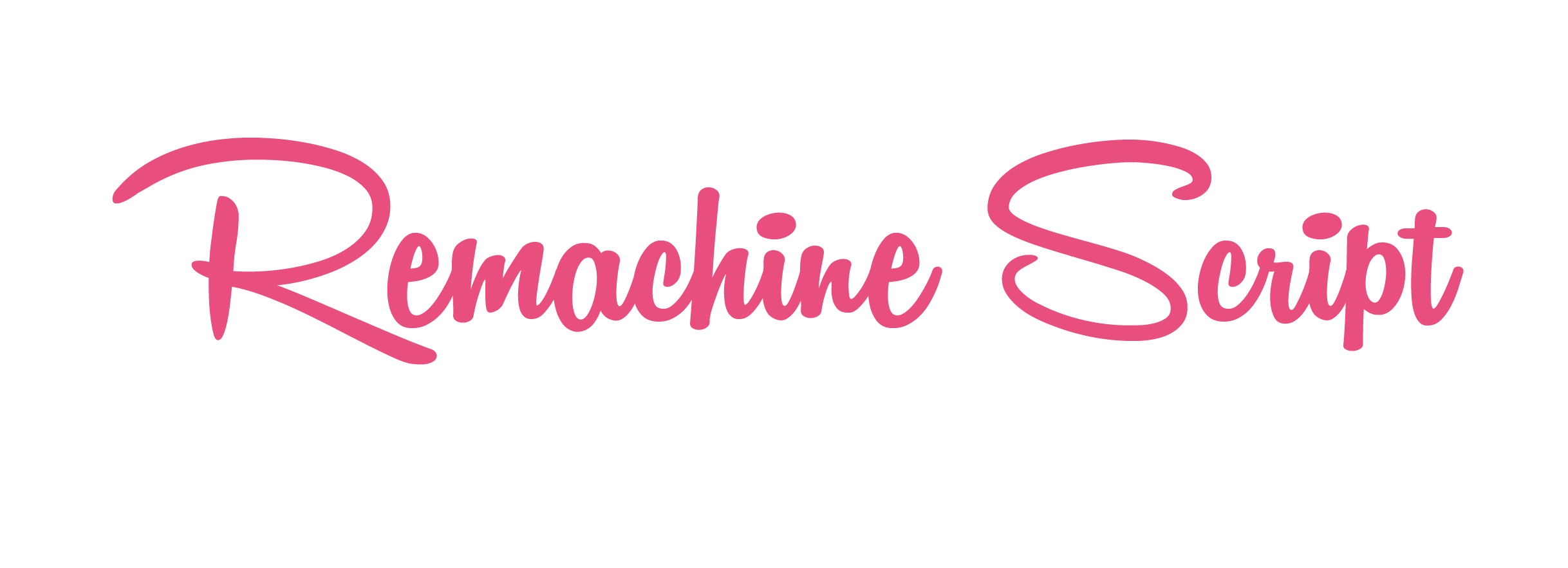
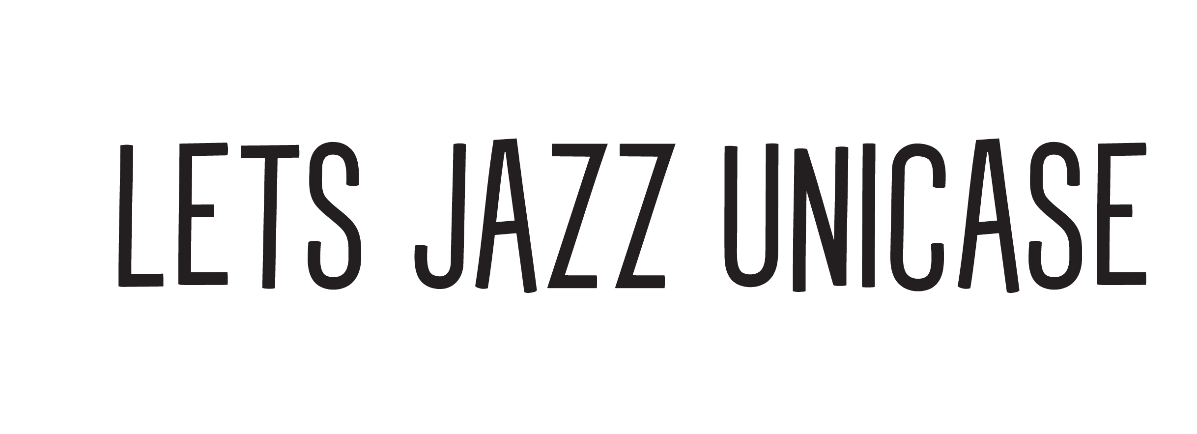
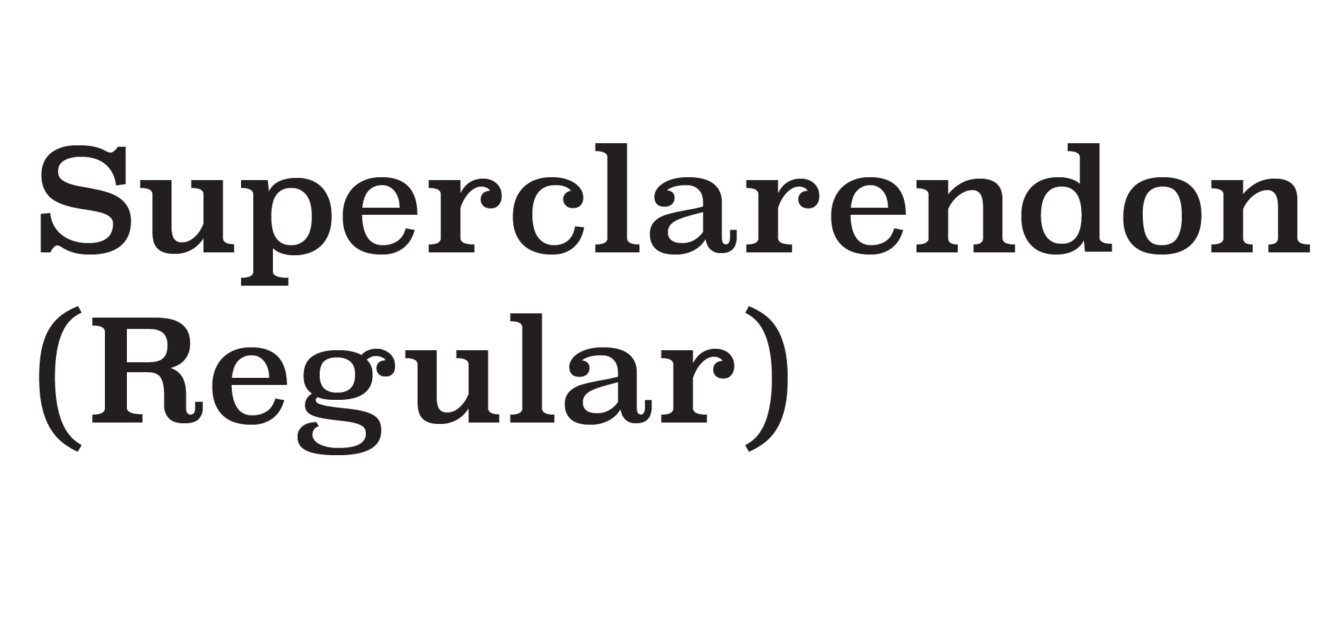
TYPEFACES/FONTS
Logo Development
INSPIRATION:
PROCESS:
RESULT:
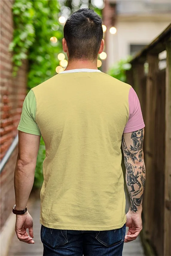
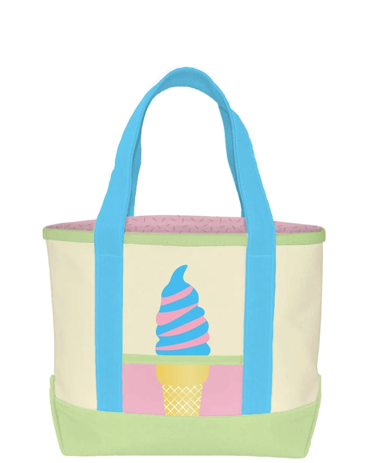
Assorted Merchandise
FRONT
BACK
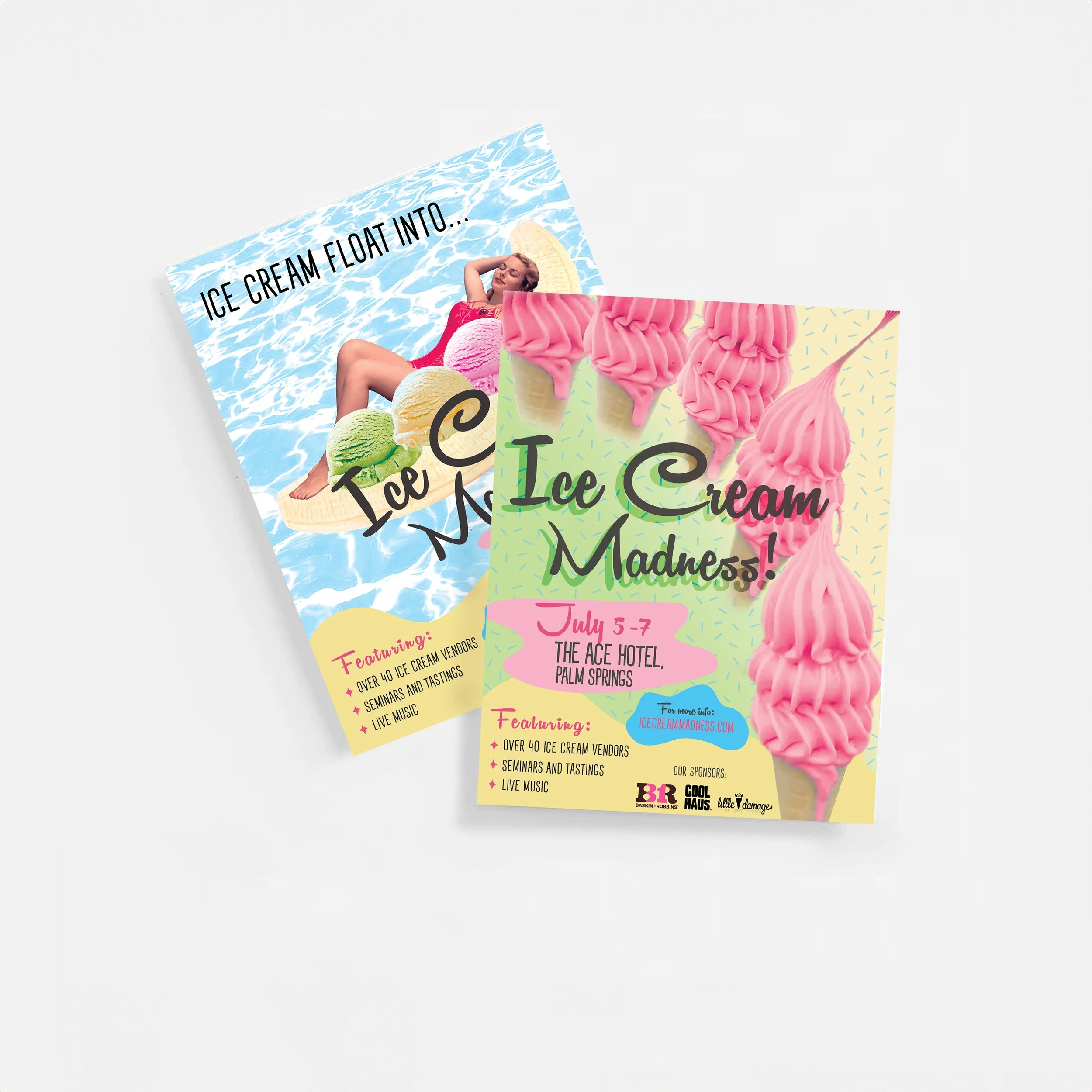
Marketing Materials
FLYERS
EVENT MAP

